Wednesday, May 26, 2010

In Profile - The Graphic Design Of Red Dead Redemption


Okay I
bet your all wondering why are you doing a post on Red Dead Redemption isn't that a video game it has no place in a design blog. Well let me clear things up I brought this game last week and everyday I find myself looking at the graphic art that has been produced for the title, It has this fantastic unique illustrated feel which is combined with the powerful colours and strokes which give it the pieces a rough emotional edge.


So what is
Red Dead Redemption I hear you asking well Red Dead Redemption is a free roaming game which is based in the wild west during its climatic period. The first thing you notice when you view the numerous posters is these incredible portraits of the games many unique characters these characters have an extremely detailed hand painted feel to them which gives you the feeling that these people have real emotion and identities.


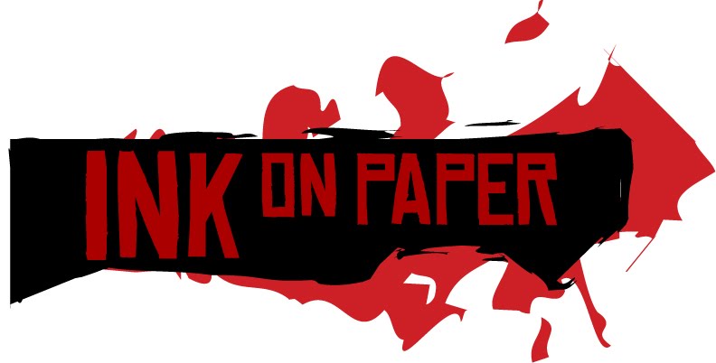
The typeface they used on every piece of work is called
Chinese Rocks , this typeface when it is mixed in with the relating elements creates such a powerful and believable look that it really is from the wild west with its long elongated lines mixed in with the sharp angles used for corners of the letter's. You almost believe that it was hand painted right on the paper.

The one thing you'll notice with there use of white is that its not a clean base white theres a dirty used tone to it, this when used along with the powerful red and black combination helps communicate the games constant tension and terror ridden story. Also when this colour combination is used its along side the characters it helps add definition to there shape and shadows.


In summary Red Dead Redemption's design campaign is one of the most well executed and well refined I would rate it right up there with one of my previous posts on Bioshocks Art Deco based work in terms of its refinement.

Referencing

Rockstar Games Presents Red Dead Redemption, (2010). Retrieved May 28, 2010,
from http://www.rockstargames.com/reddeadredemption/

Magazine Publishing - IDN


Whats Idn you say, well Idn is short for international Designers Network its a magazine which showcases the best Design work from around the world. It covers all the major genres of design from graphic design,Interactive, gaming, animation and web design. Idn's articles serve as a final show case for what ever is been focused on. So why did I chose Idn to focus on besides obvious reason well its the totally unique way it is produced every page is change altering just like a creatives mind brainstorming away, the feel alters with the ever changing stock i can remember an issue which covered magazine editorial where I counted 16 different types of paper used in one magazine. to me this magazine is eye candy for a designer a great source of inspiration I always have 2-3 copies on my desk just to flick through to inspire a knew train of thinking.

As you can tell by what Ive said earlier that
Idn is aimed at a very niche market and that market is us the creatives, there not trying to attract joe blog of the street, its meant for us the creatives from the covers all of which are dedicated to the specific them of the issue. With every page you flick though you'll notice large to subtle changes in the layout of type and images it can be a little intimidating at first but once you get used to the every changing layouts it starts to become like an amusement ride. The one great thing about Idn and its layout is that there all a combination of different styles and techniques and it all seems cohesive.


Overall I highly suggest to anyone who is involved or interested in getting into the creative industry to read and dissect
Idn its a great place to learn be entertained and immerse in the world of design.

Referencing

IdN v17n2: Retro Graphics, (2010). Retrieved May 29, 2010, from
http://idnworld.com/mags/?id=v17n2

Interactive Design v1.4 - Advertising


Advertising in interactive design has some surprising parrells to that of advertising in printed media, there both trying to sell something a service, product or a person and push the branding for with the intending result of the advertising being a that of a financial gain for the client. The only difference is that advertising through interactive media has movement whilst the graphic design is limited to being static.

So maybe your wondering
so what exactly does an interactive designer produce for advertising, well the most common item is a flash banner you'll find these on nearly every web site you go on these are fantastic for getting the word out about specific products/services and often contain alot of movement so that they catch your eye, then you have the GUI which i covered in a earlier post these are usually produced for clients with big pockets and are wanting to make a large impact, the advantages of these compared to the banner is that you can design a GUI to contain alot richer content and lastly the most common one you may see is flash based movie now these differ from banners as these have a larger space to work in and are used in a centralized way unlike a banner which is hidden away, they are all movement based and are on a constant loop.

So as you can see from my brief listing of the most common interactive based advertisements, there is a large scale of options depending on the budget of the client. Overall advertising is the main business you will find in the interactive media there not usually the biggest jobs but they offer a challenge to push we as creatives to fill a space and sell a product on the worlds busiest exchange the Internet and personally that is the biggest challenge of all.

References

Interaction Design. (2008). Retrieved May 19, 2010, from
http://en.wikipedia.org/wiki/Interaction_design

Interaction Design Blog. (2009). Retrieved May 19, 2010, from
http://www.interactiondesignblog.com/

Tidwell, J. (2005). Designing Interfaces. California, United States Of America, O'Rielly.

Magazine Publishing - EGM[i]


So I've covered alot of print based publishing and I thought it was a good chance to change things up when i came across EGM[i] . EGM[i] Now or in its full name Electronic Gaming Monthly Interact is a fully web based interactive magazine that was launched in april this year. Egm was for over a decade Egm was a print only based publication until 2009 when there owners went under due to rising cost for producing the magazine in its current format, the magazine closed down until the original owner Steve Harris reacquired the rights of the magazine and choose to release the magazine in a digital format that has a strong focus on interactivity with its readers.


The fact that this magazine is a fully interactive experience for the reader shows, It shows a considerable development from the earlier digital magazines that were effectively Pdf's of the publication which were not making any real attempt to create a unique publication for the digital side of the magazine. This is what really makes EGM[i] stand out you can tell that there has been alot of time spent in developing a truly unique user experience which makes the reader feel apart of the world of EGM[i] every page has something new and fresh to grab your attention.


EGM[i] still carries on a legacy of a traditional publication in terms of the layout of the articles and text, but adds movement to pages with scrolling titles and video's playing whilst you read, in doing this they make every page an event. this publication in my opinion represents a landmark in the future of magazine publication.

Referencing

EGM[i] The Digital Magazine. (2010). Retrieved May 27, 2010, from
http://www.egmnow.com/

Electronic Gaming Monthly. (2008). Retrieved May 27, 2010, from
http://en.wikipedia.org/wiki/Electronic_Gaming_Monthly

Harris, S. (2010, March 10). EGM[i]: The Digital Magazine Preview [Video file].
Retrieved from
http://www.youtube.com/watch?v=zGxQHboJAEs

In Profile - Bioshock's Art Deco


Whats Bioshock I hear you say, well Bioshock is a Video Game which is based during the 1950's in a underwater utopia called Rapture which has fallen into complete disrapear and the for inhabitants are now geneticaly altered creatures, now your wondering why im writing about this in a design blog. Well Bioshock's world is influenced completely by that of the art deco of the era.


So youre in Rapture the tensions building and u walking through these beautiful bar's and build which a covered with these art deco posters and signs some are in complete perfect condition others have been torn to pieces just as if they are falling apart with the city itself, for example lets look at the on of the poster's that is placed in the game, if you look it on face value you would say it has been drawin on by an insane person, but if you take the time to look at it you can see the inoccence of the art deco graphic design that was originally there, the young flawless woman smiling and enjoying life thats the perfection which only art deco can achieve.


I always find myself look at every poster I pass in the game just to take in the fantastic indentities of each of the citys business, it makes the world so believable. Art deco is such a distict look which can carry several emotions of power, wealth, inoccence and beauty this makes it perfect for the city of rapture it was once a utopia of which there was no rules and you can see how the art/design team has interpeted it through the long elongated lines of the text and the picture perfect characters.


I personally find great inspiration in art deco, but its the unique application of which Bioshock has applied it in a graphic design sense to create a scene for the world. The logo's, posters, banners are the citys soul and great credit should go to the graphic designers were used in the creation of them.

Referencing

Bioshock Official Website. (2008). Retrieved May 26, 2010, from
http://www.2kgames.com/bioshock/enter.html

Cult Of Rapture. (2009). Retrieved May 26, 2010, from
http://www.2kgames.com/cultofrapture/


Magazine Publishing - Fashion

Fashion magazines the real glitz and glamour of the publishing world, there recognizable with there glossy front covers, great photography and refined titles Vogue, Elle, Nylon, Bazaar just to name a few, these magazines are the masters of sending emotions through the viewers mind they literally feel expensive to hold and flick through. Imagery is king in these publications ever page has some thing any viewer would aspire to wear and be admired by others, they are journeys into are sub conscious desire to be look and feel glamorous.

Vogue Australia
Vogue is easily the biggest Fashion magazine in existence anybody who's anyone knows of it its the Google of the fashion publication world for all you tech heads out there. I've chosen the Australian edition of Vogue to see how fashion publications are handled down under.

When you first see
Vogue your eyes are instantly drawn to the center of the cover where a fantastically captured full body portrait of a model is shown not only is this a great way of balancing a page but it gives a feeling of a confrontation with the image. the logo is placed at the very top of the page in the center but it is hidden behind the main image, the text itself is in superbly well balanced positioning with a combination of both bold type but also an elegant type face is also positioned on the cover a interesting feature is that not only is the type effective the colours used in the typefaces both match and flow with the image to form a cohesive piece of imagery instead of bits and pieces.
So once you've passed the cover and you start to flick though the first dozen pages you'll notice an almost limitless amount of 2 page spread advertisements each more unique than the next, Making the magazine feel like a fashion show your constantly bombarded with these glamorous shots of models displaying these fantastic new fashions.

Referencing

Vogue Australia. (2006). Retrivied May 25, 2010, from
http://www.vogue.com.au/

Interactive Design v1.3 - Actionscript as3


Actionscript is the object orientated coding language of Flash, I Refer to it as the the numbers and letters than form many a sleepless night. Actionscript is the backbone of all interactive creations, if you want to create all those fantastic multi layer interfaces, Flash Games and what ever else you can think of that involves a user interacting with some of your work then Actionscripts what you need to know.


So by the first paragraph you can easily see how vital a role a knowledge of Actionscript is to a Interactive Designer, but its one of those few things were your knowledge of this rather complex code is up to creative its all open source and that allows hours of experimentation for no cost which is fantastic and allows a creative thinking that I don't think is possible in the print media due to costs of printing.

But by no means is this an easy code to learn for the majority of us, there are some parts of to it which require the ability to use complex equations to predict the movement of objects etc, but dont let this scare you away from it, because for the most part when your coding up for a menu its just a very basic and repetitive coding. Which is not that stressful on the mind once you have figured the basics out.

So to wrap it up actionscript is vital to interactive designers and whilst some of the code is scary and confusing we just have to live with the complexities of it and just adapt the best we can because what is able to be achieved with the use of code and flash is limitless.


References

Interaction Design. (2008). Retrieved May 19, 2010, from
http://en.wikipedia.org/wiki/Interaction_design

Interaction Design Blog. (2009). Retrieved May 19, 2010, from
http://www.interactiondesignblog.com/

Develop Php.(2008). Retrieved May 18, 2010, from
http://www.developphp.com/

Tidwell, J. (2005).
Designing Interfaces. California, United States Of America, O'Rielly.