
Okay I bet your all wondering why are you doing a post on Red Dead Redemption isn't that a video game it has no place in a design blog. Well let me clear things up I brought this game last week and everyday I find myself looking at the graphic art that has been produced for the title, It has this fantastic unique illustrated feel which is combined with the powerful colours and strokes which give it the pieces a rough emotional edge.

So what is Red Dead Redemption I hear you asking well Red Dead Redemption is a free roaming game which is based in the wild west during its climatic period. The first thing you notice when you view the numerous posters is these incredible portraits of the games many unique characters these characters have an extremely detailed hand painted feel to them which gives you the feeling that these people have real emotion and identities.

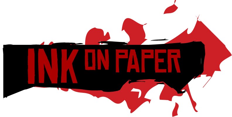
The typeface they used on every piece of work is called Chinese Rocks , this typeface when it is mixed in with the relating elements creates such a powerful and believable look that it really is from the wild west with its long elongated lines mixed in with the sharp angles used for corners of the letter's. You almost believe that it was hand painted right on the paper.
The one thing you'll notice with there use of white is that its not a clean base white theres a dirty used tone to it, this when used along with the powerful red and black combination helps communicate the games constant tension and terror ridden story. Also when this colour combination is used its along side the characters it helps add definition to there shape and shadows.

In summary Red Dead Redemption's design campaign is one of the most well executed and well refined I would rate it right up there with one of my previous posts on Bioshocks Art Deco based work in terms of its refinement.
Referencing
Rockstar Games Presents Red Dead Redemption, (2010). Retrieved May 28, 2010,
from http://www.rockstargames.com/reddeadredemption/
from http://www.rockstargames.com/reddeadredemption/
Love this game! And yes design of it is pretty well tied in and most definitely slick. Its also very typical Rockstar branding, which i guess is a good thing since people will recognize it straight away.
ReplyDeleteCan't say I like the game, too cowboy-ish for me haha.
ReplyDeleteBut I gotta say, really cool art style and all. I love concept art in games. The way they've advertised the game really goes well with what the game is about, the whole Western thing.
I agree, the cover does make the game look pretty violent. Rockstar recently discussed, the violence in their games, addressing who the games are mad for, and they said, 'If you're a parent and buy one of our games for your child, you're a terrible parent'. Got to love Rockstar for just saying that platantly.
ReplyDeleteThe link:
http://news.bbc.co.uk/newsbeat/hi/technology/newsid_10130000/newsid_10136300/10136311.stm
Ah, GTA: horses.
ReplyDeleteNo other games company puts as much love and attention into the design and packaging as R*
Most other companies just give you a map in the game, or let a third party put one on the web, but R* put it into the packaging.